For most of the people, the year 2020 was a disaster in many aspects, but it turned out pretty good
for my data analysis streaks. I did a lot of data analysis on many data-sets ranging from Running Records
to World's Tea Export. Some received positive response while on others negative. Nonetheless,
I enjoyed each one of them. They were all scattered throughout many social media posts over the year.
Here I am trying to create a collection of selected visualizations. I hope you enjoy them.
Job Hunting during the pandemic : This Sankey plot is derived from the data collected during the career transition of my wife in 2020. It shows how stressful was to find any job during the pandemic even for highly skilled person1.
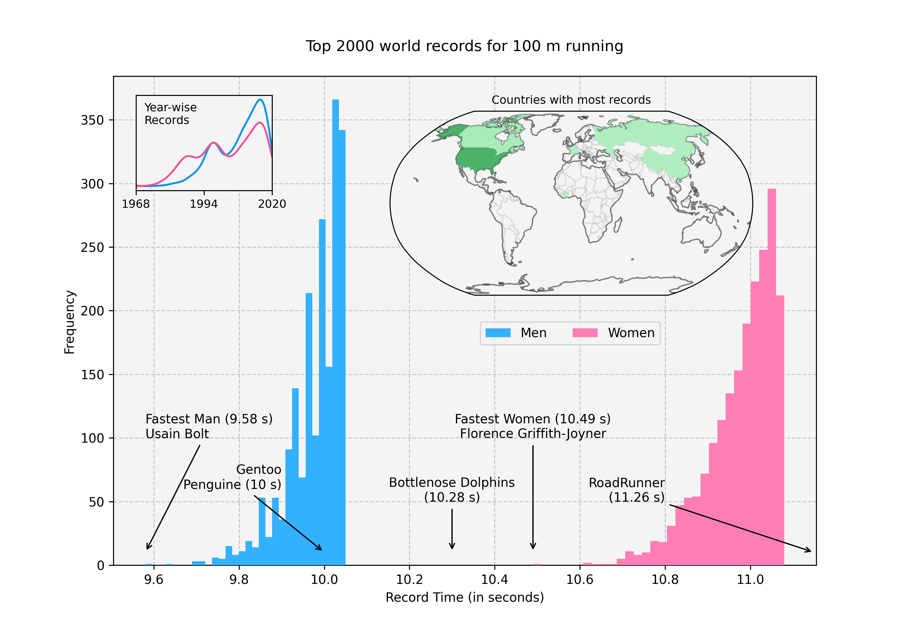
Top 2000 world records of 100m running : You can clearly see huge difference between male runners and female runners. In addition, it shows how world records were increased heavily in recent years compared to past2
Number of times country is referenced in the Big Bang Theory : Big Bang Theory is one of my favorite sitcom. I analysed its subtitles from each episode. After little NLP analysis, I landed up on this 3.
Top 20 word stems appeared in the book titles : Before naming your book, take a look at this plot 4 :)
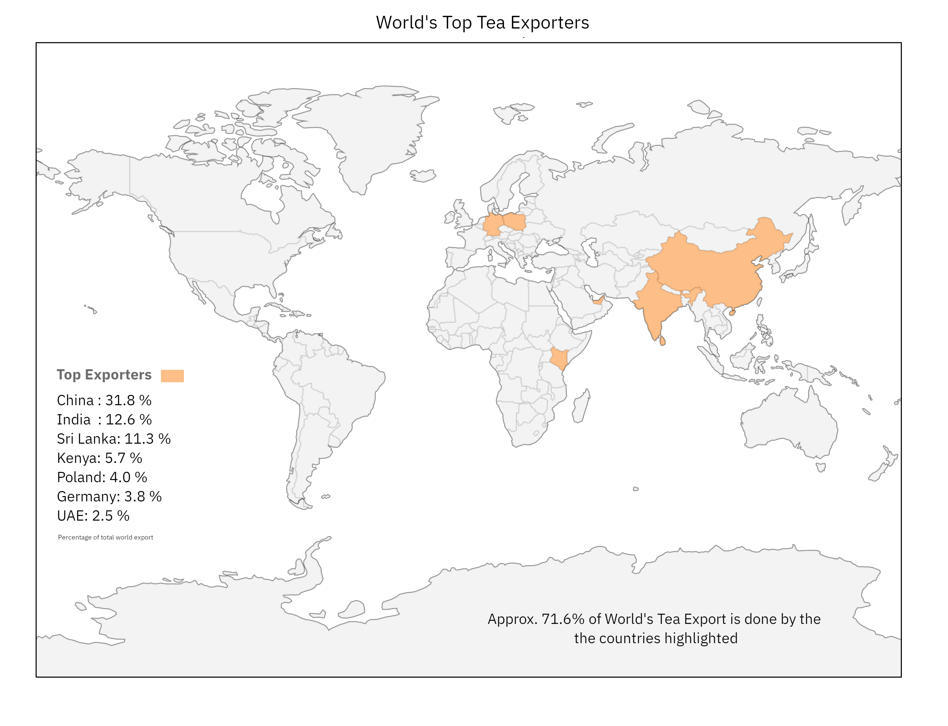
71% of world’s total tea export is done by these countries : I was surprised by Germany and Poland in this list. However, I leaned that they are also in top countries who import tea. After reading further about this, I learned very interesting trading practices. Many countries import raw tea and export flavoured tea!5
Relationships of FRIENDS characters : FRIENDS is probably one of the best sitcom I have ever watched. Being huge fan of this TV Show, I did little data analysis on it as well. It was interesting to see Joe at the bottom this chart given how his persona was created in the original serial 6.
Top Exporters and Importers of COVID-19 essentials : My data-analysis streak won’t complete unless I did at least some analysis on COVID-197.
Nobel Laureate in Medicine : where they were born and where they worked : This analysis was inspired from anther very interesting analysis on Nobel Prizes in Chemistry8.
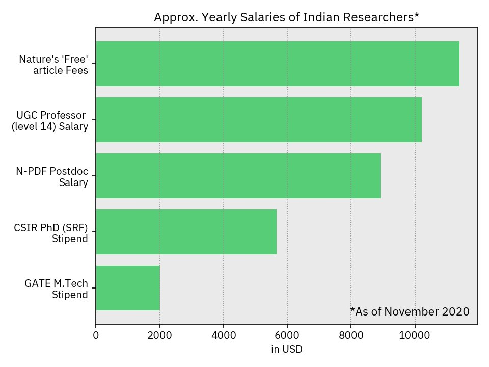
Nature’s recent ‘free’ article fees in the context of yearly salaries of Indian researchers : I posted this graph on twitter when Nature Publishing Group released their ridiculous fees for Open Access article9.
115 Years of rainfall in Meteorological Subdivisions of India : This very rich data-set clearly shows how Indian Monsoon enters and retracts10
There were many other memes, illustrations and data analysis I performed in 2020. Follow me on Twitter,
Reddit or LinkedIn where
usually I post my data-analysis related work!