When we are analysing big data, many times we encounter weird correlations. There is a scientific name for it - Spurious Relationship or Spurious Correlation 1. You may have heard about the book
by mathematician Tyler Vigen which talks about this phenomenon. It is no surprise that I often encounter them in my daily data analysis tasks. Most of the time I ignore it and move on to the next analysis. However, the case I am going to talk about has so many such relations that I decided to write a full blog article for it. In the end, I will try to reason why we are getting so many correlations in this case.
Indian Premier League
Indian Premier League (IPL) is one of the most famous T20
the tournament in the world. It was the first sporting event which was broadcast live on YouTube 2. Since 2008,
there have been 13 seasons of IPL generating a tremendous amount of data and feast for data-scientists :) I had my eye on IPL data
for a long time and finally got a chance to play around with that data. While playing around with data, I realize there are these weird correlations keep popping up. Hence, I decided to focus on finding these ‘spurious’ correlations than doing any specific analysis task.
The Data
There are many IPL datasets available on the internet. I used the one on Kaggle and
curated by Prateek Bhardwaj. I think the original data was scraped from CrickInfo. Data contains statistics
of 816 matches played between 2008 - 2020. Out of which 5 matches were tied. I performed data cleaning by converting team names to their location.
It was important as few of the teams had changed their names over the IPL seasons. The outcome of every match is shown in Fig 1.
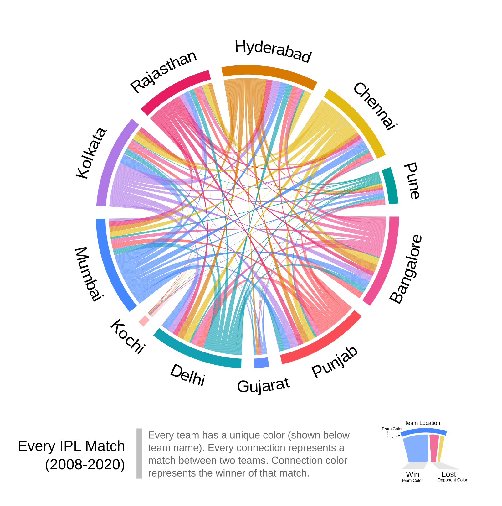 |
| Fig 1: Outcome of every match in IPL (2008-2020). Tie matches are not shown. |
Spurious Correlations
I tested the correlation between few variables related to the cricket match and a total number of matches won by the given team.
Few selected ones with a good statistical correlation are shown below. I fitted line
to these correlations and tested R2 value for each correlation. Closer the value of R2 to 1, better
is the correlation.
Let us start with the toss :)
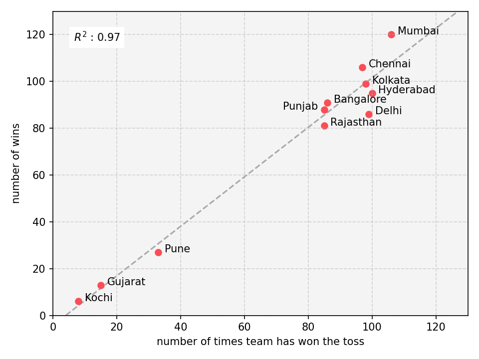 |
| Fig 2: Correlation between number of times team won the match vs number of time they won the toss |
Now team has to take a decision weather to bat first or field.
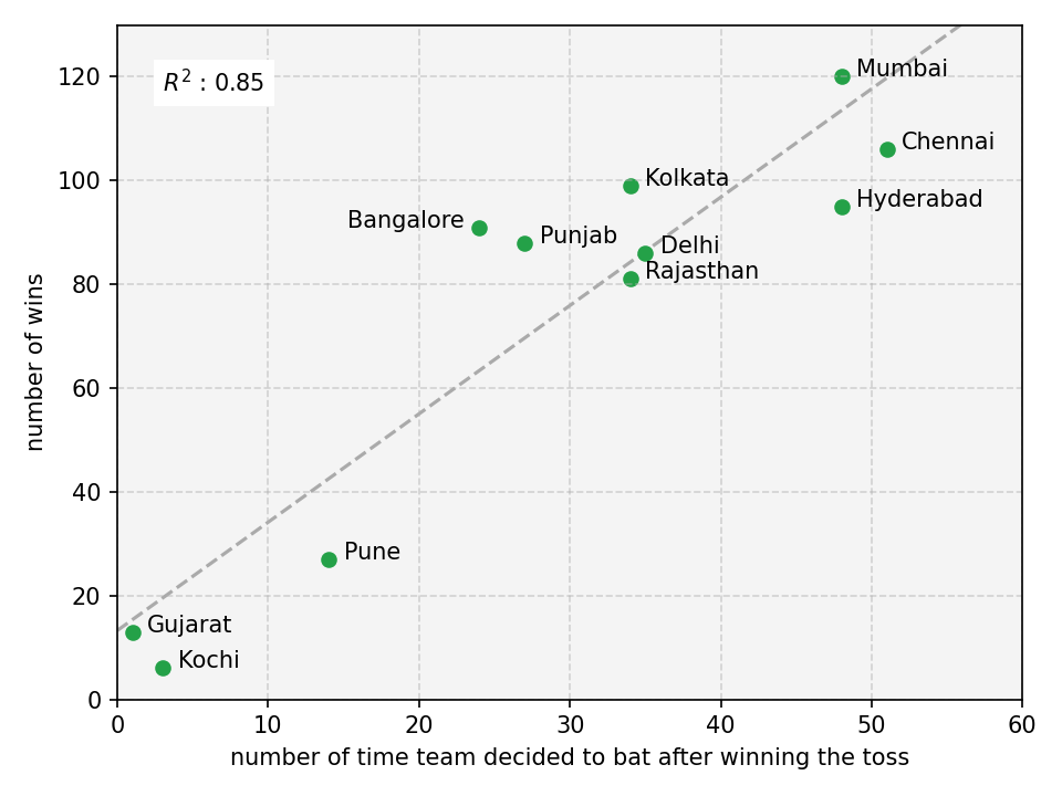 |
| Fig 3: Correlation between number of times team won the match vs number of times they decided to bat first after winning the toss |
What if they decoded to field first instead bat?
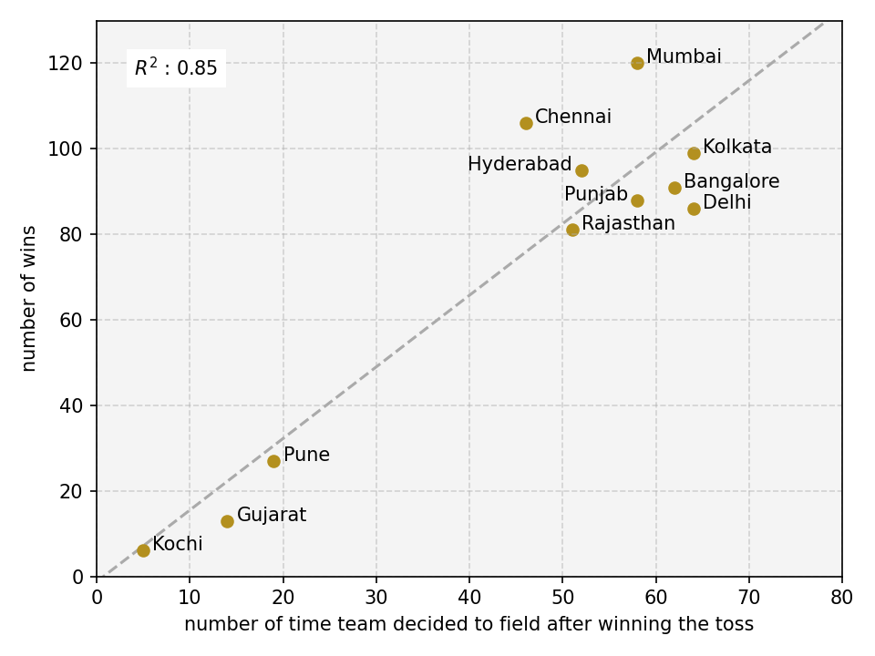 |
| Fig 4: Correlation between number of times team won the match vs number of times they decided to field first after winning the toss |
Is it depend on number of matches team has played? Why not :)
 |
| Fig 5: Correlation between number of times team won the match vs number of matches played by that team. |
Maybe weather is affecting these results? Well, I did not have time to extract historic weather data, but
I did next best thing. Looked at in which city match was played.
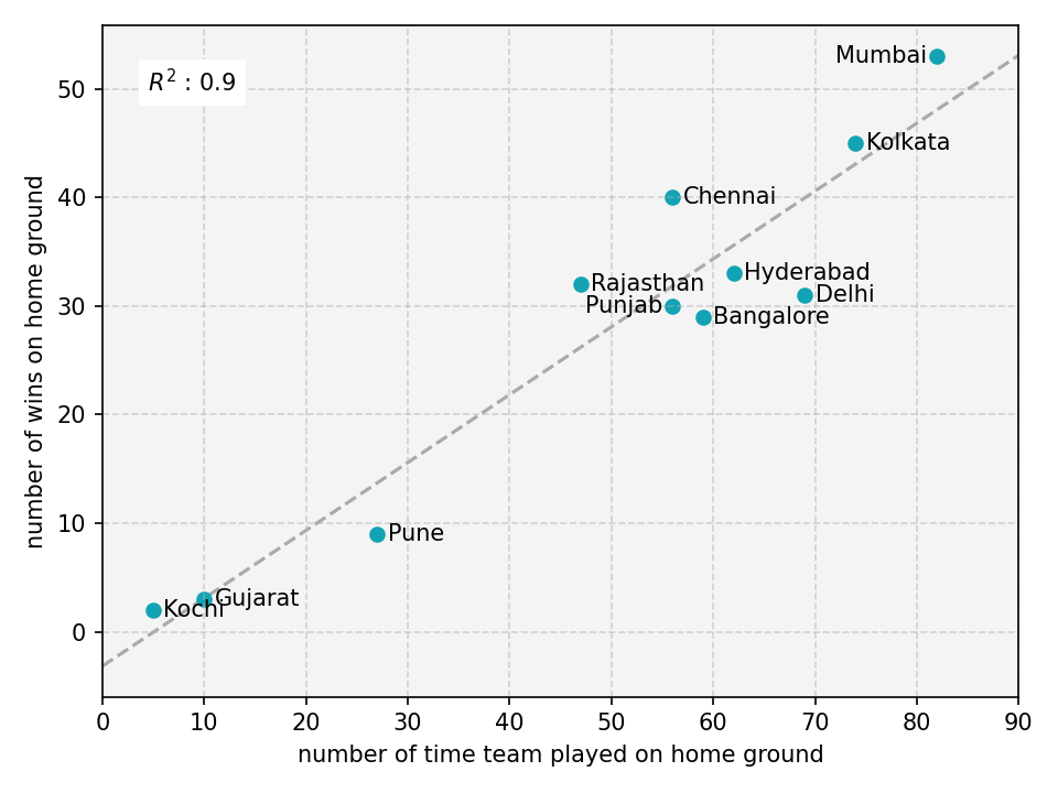 |
| Fig 6: Correlation between number of times team won the match on their home ground vs number of team has played the match on their home ground. |
What is happening?
If you are a keen observer, it is pretty obvious that all these correlations might be due to two clusters of teams,
Pune, Gujarat, Kochi (which were active for only few IPL seasons) vs rest. R2 value dropped drastically when I removed those teams from the
correlation analysis (See Fig 7). I observed a similar trend in all other plots.
 |
| Fig 7: Correlation between number of times team won the match on their home ground vs number of team has played the match on their home ground. After removing Pune, Gujarat and Kochi |
These three team were clear outliers in my correlation analysis. How can I prove this in more systematic way? I just aggregated data
shown in all the plots above and then performed PCA. I was happy with the results. As expected, I can clearly see two clusters
of team (see Fig 8). It suggests that 95% of variation in this data can be explained by just single variable (see x-axis of Fig
8).
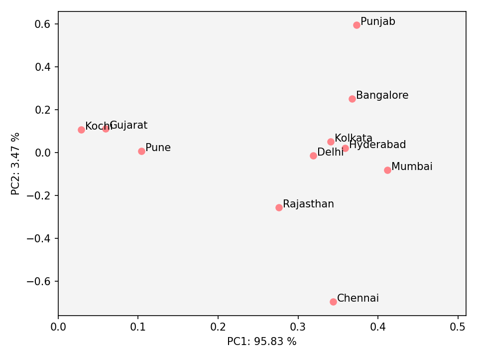 |
| Fig 8: PCA plot of all the data shown in this article. |
Another way to perform proper correlation is by normalizing each team with their number of matches played. You can see the
correlation vanishes (as seen by lower R2 value) in Fig 9 in contrast to Fig 2.
 |
| Fig 9: Correlation between number of times team won the match vs winning toss. Data is normalized to number of matches played by the respective team. |
There are still more variables in this dataset which can provide more ‘spurious’ correlations. Maybe next time:)
References
- Spurious relationship - Wikipedia [Accessed on 12 Dec 2020]
- IPL matches to be broadcast live on Youtube - ESPNCricInfo [Accessed on 12 Dec 2020]
Full code can be found here and here.
All web links provided in this article are accessed on 13 Dec 2020 (if not mentioned otherwise)
(Header image by Gerd Altmann from Pixabay, released under CC0-license.)