

Published on 25 August 2018
random data analysis and visualization :)


In my previous post I have described how the Indian Railway database is rich in information and how we can visualize this data in the better way. This post is a continuation of that analysis. Here, we will explore how this data can be visualized by using a real map. You can use a simple python code to perform this analysis by yourself. Please refer previous post to check how data was obtained and curated.
This is a little bit technical section, a reader can skip this if they just want to enjoy visualizations :) Major difficulty I faced while performing this analysis is regarding visualizing geographical data. I wanted to use India’s map to explain different trends of this data. There are some standard python libraries like basemap which are shipped based on matplotlib. However, while installing these libraries in my windows environment, I was running into some or another problem. They have very peculiar dependencies. My conda virtual environment was also not able to install them properly. Finally, I decided to work with osmnx which wraps around geopandas and networkx. This library is good but has very simple functions which are not very intuitive to customize. Nonetheless, I decided to workaround by using some dirty hacks. Check out code comments for a better understanding of how various functions are working. Many plots shown in this post are modified after plotting to add legends and other information 1, 2. There was a problem in plotting Lakshadweep and Andaman and Nicobar Islands on the current scale because of their size and no ‘map polygon’ availability in OpenStreetMap. Query to OpenStreetAPI was returning ‘point’ object. If I tried to put this on the current map by converting it to a polygon, I was not getting proper scaling. Hence finally I decided to not plot them on in this analysis.
As soon as my code started working, the first thing I checked how different train stations are distributed across India. I sorted all the data with unique railway station codes. Then I checked in which state those stations are present.
 |
|---|
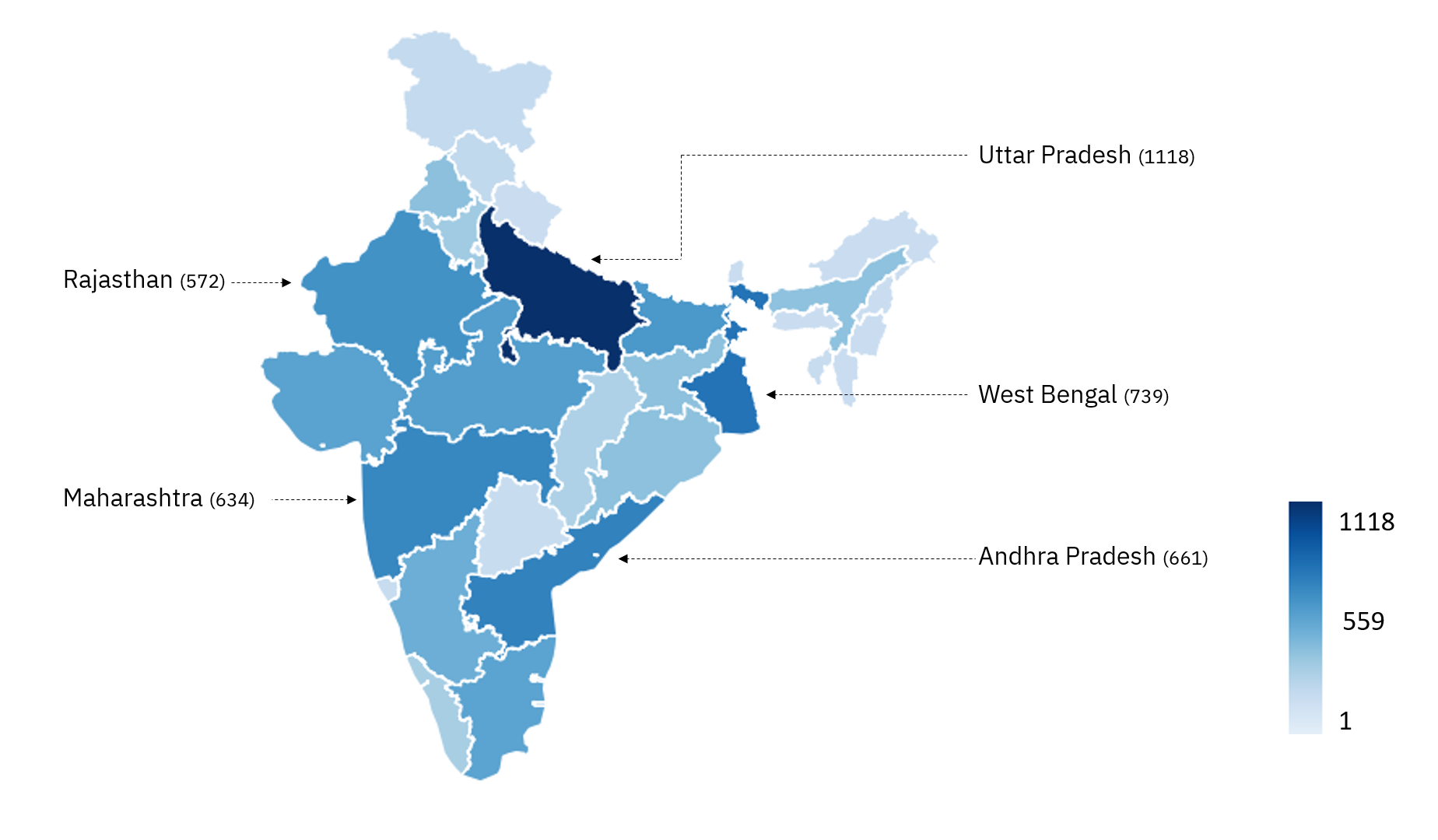
| Fig 1: Distribution of total railway stations across Indian States 1, 2, 3. Top 5 states are with most number of railway stations are shown. |
Fig 1 shows that, as per our data-set, Uttar Pradesh has the most number of railway stations in India. It has 1118 railway stations out of total 8155 railway stations in all over India. This represents 13.70% of total train stations in India. Top 5 states represent45.66% of a total railway station in India.
 |
|---|
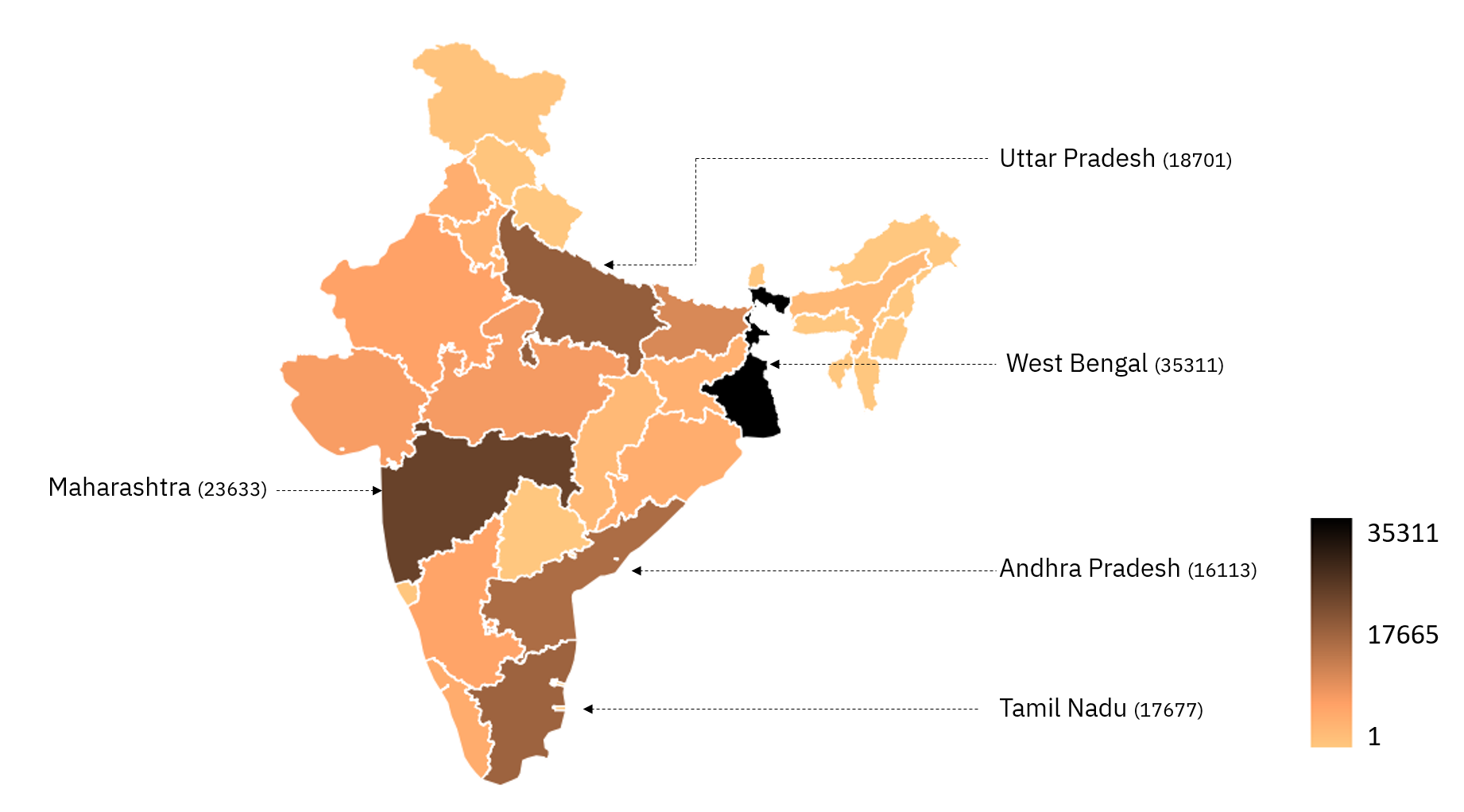
| Fig 2: Distribution of total railway stops across Indian States 1, 2, 3. Top 5 states are with most number of railway stops are shown. |
Next, I checked which state has the most number of train stops. This can be calculated by checking every stop on each train. As Fig 2 represents, West Bengal has the most number of railway stops in India with whooping 35311 stops representing 18.97% of all the rail stops an entire country. Top 5 states represent59.88% of total railway stops.
To understand where the most number of trains are originating, I checked a number of train origins. Train origin represents railway station at which given train is starting. From station name, we can calculate trains originating from a given state.
 |
|---|
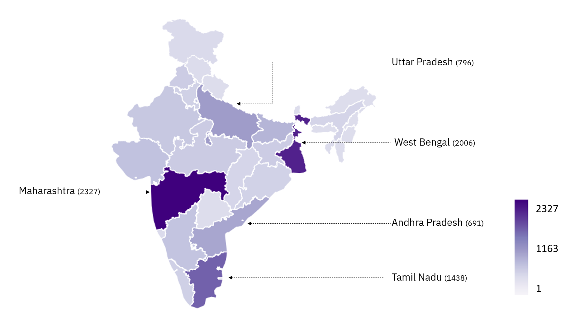
| Fig 3: Distribution of number of train origins across Indian States 1, 2, 3. This represents number of trains originated from given state. |
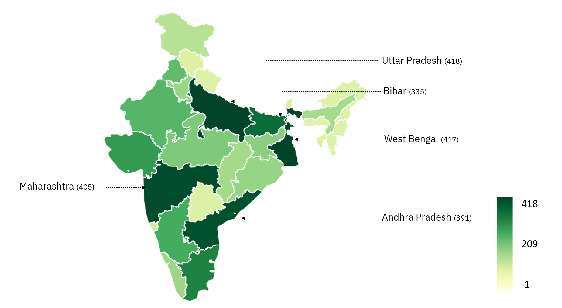
According to Fig 3, most of the train originating from Maharashtra. Total 2327 trains out of 11114 that is 20.93% of total trains originate from Maharashtra. Looking at other top states, one can think this is due to a large number of locals and suburban train origins. I have discussed this issue in my previous post also. However, now that we have a way of differentiating between suburban and long distance trains, we can check which state has the most number of long-distance train origins.
 |
|---|
| Fig 4: Distribution of number of long distance train origins across Indian States 1, 2, 3. Top 5 states are represnted in the map along with number of long distance trains originating from them. |
As seen in Fig 4, most numbers of long-distance trains originate from Uttar Pradesh. Total of 418 trains out of 4395 originates from Uttar Pradesh. West Bengal also shares an almost same number of train origins (417). These two states account for 18.99% of all long-distance train origins in India.
So far in my life, almost all the time my train departure was in the early morning or late at night. Hence I looked at how different trains are departed or arrived at the station. First and foremost I checked at what time trains depart and arrive.
 |
|---|
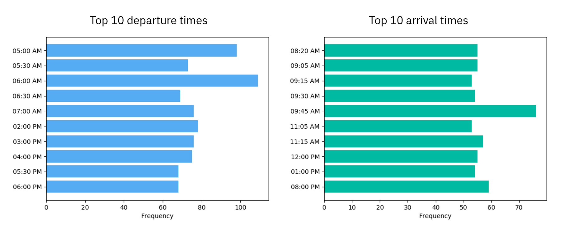
| Fig 5: Distribution of common timings. |
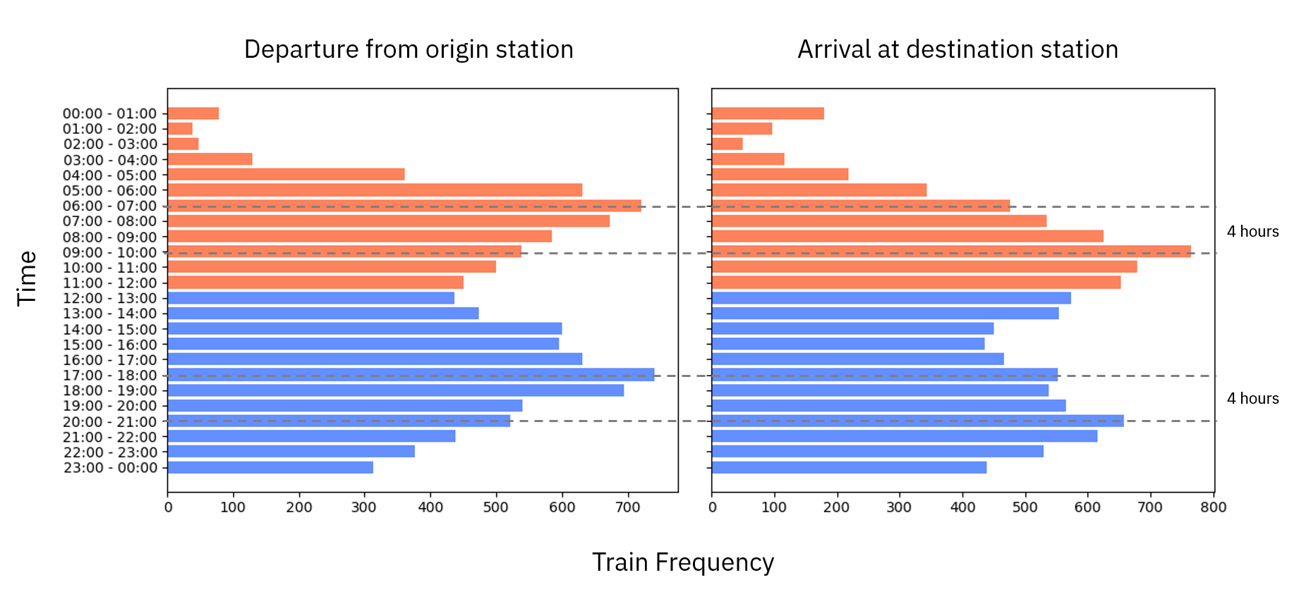
As expected, the most common timing for a departure of the train is 6 AM (Fig 5) while for arrival is 9.45 AM. By excluding local and suburban trains, this time still remained similar. However, this is a very crude approach to conclude anything. To get a better idea we need to plot the departure and arrival timings of all the trains. Hence, I binned these timings into 24 hours and plotted the same graph again.
 |
|---|
| Fig 6: Distribution of departure and arrival times of each trains. |
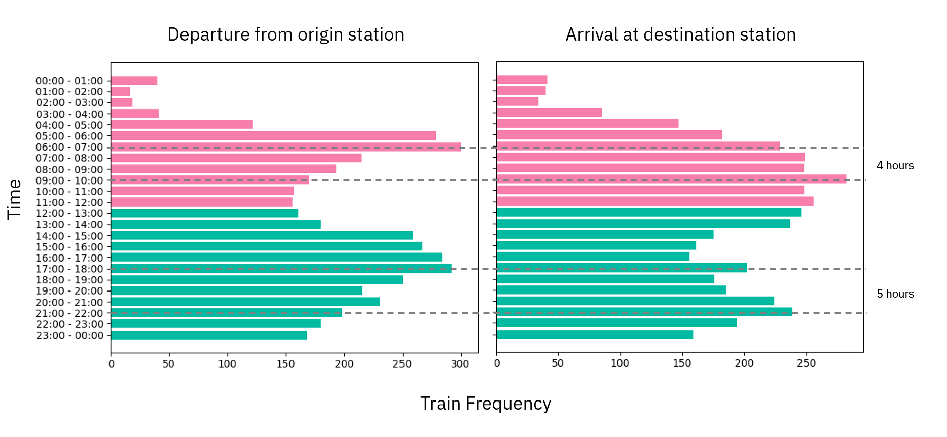
I was surprised to see a bimodal distribution of both arrival and departure timings. Moreover, there was almost 4-hour shift in peaks between departure and arrival timings. As expected, I found two peaks. However, after looking at departure - arrival time peaks, I realized it is closed to office time. Then I remember again that it might be an effect of local and passenger trains. To my surprise, even for long-distance trains, this bimodal distribution remained similar. Only evening arrival peak shifted by 1 hour (See Fig 7).
 |
|---|
| Fig 7: Distribution of departure and arrival times of each long distance trains. |
In conclusion, a very simple database can be visualized in a countless different way giving us an opportunity to understand it in better ways. I can do again a lot of a different kind of analysis on this limited data-set like what is the distribution of train stops, how train stops at different states and stations, how different states have different arrival and departure timings etc. There are many possibilities. We just need a small amount of programming knowledge to uncover such non-obvious trends. In the future, I will visit this data-set again with little bit more complex graph theory and network analysis.
Code used in the above analysis can be found here.
(Header image is downloaded from Pixabay.com under CC0-license)