

Published on 10 September 2018
random data analysis and visualization :)


Update: New and updated version of this blog is now available here.
I am obsessed with good colors. I particularly pay attention to all the colors I have used in my illustrations and graphics. This is extended to my data visualization also. There is huge amount of literature on how selecting correct colors impact your work 1. I recommend you to read one very old blog Elegant Figures by Robert Simmon. This blog series not only talks about the basics of color theory but also the inspiration one should take to select colors for visualization. This blog post is all about colors and the inspiration behind my new python library SecretColors. For those who just want to check out library functions and comparison with matplotlib can skip the following section and can directly check out next.
I was on the hunt for some good color palette. Obviously, every visualization is unique and need colors of its own. However, I was looking for some common colors which I can use in ‘most’ of my graphics and visualizations. I am no expert in the science of colors neither a good artist. It would take a lot of time for me to come up with a properly tested color palette. Hence I turned to existing color palettes which should provide me enough push to make my own.
As mentioned in Robert’s blog, the first color palette I came across and was very popular ColorBrewer. Although many people already use this heavily, I kinda liked it initially and then quickly realized its limitations. This palette cum tool is perfect for some small visualization or simple plot. However, my personal opinion was that colors from this palettes are a little bit dull. Maybe this is because palette was originally designed for cartography and not for illustrations. Nonetheless, I still use this palette every once in a while especially when I have to print some illustrations.
I often create mobile apps for personal and public use. I try to follow android app design guideline set up by Google3. In addition to their guidelines on to structure your app, Google has been developing a new design language called Material Design. Immediately after reading about this, I started implementing its principles in my own apps. While reading this I stumble upon gold mine for colors Google Material Design Color Palette. This palette changed my views about how one should select colors. I learned the concepts of primary, secondary and accent colors. Another most important thing I learned (and have implemented in my SecretColors library) is that what text color I should use in the different color background.
I was using material design colors happily until I found out about IBM Design Language. I was in search of a perfect font (story for some other time) and found this design language. They have an entire section on colors. Once I saw IBM color library, I knew this is the palette I was waiting for. This carefully color palette has colors for all kind of usage. This is my current vibrant goto color palette (until I find something better).
Once I knew what kind of colors I wanted in my visualization, I just had to copy paste them into plotting library. Initially, I did not feel any difference but as projects diversified, I was spending unnecessary time going to websites, copy pasting hex values and then testing the plots. Finally, I decided to make my own library which should give me quick access to what I want. That is when this new library SecretColors was born.
I use python for most of my data analysis and visualization projects. I could go on telling you advantages of python over others but I think there are plenty of debates already existing on the internet 3, 4, 5. In the end, the answer is, it is your choice and your convenience. Hence, the further article will only deal with python and it’s plotting library matplotlib but colors used in this library are freely available and one can easily adapt them to use in their own analysis using any programming language.
This library is Open Source and has released under MIT license. You can find all the code on its GitHub project and can compile your own. The library is available on PyPi and can be installed by the following command
pip3 install SecretColors
This library only supports Python 3+ and has a dependency (at least until version 0.0.3) on random and warnings which are shipped along with basic Python3 distribution. So essentially it should run without needing to install any new dependency. Basic usage and commands are provided on GitHub page. Here I will just compare it with inbuilt color palettes in matplotlib
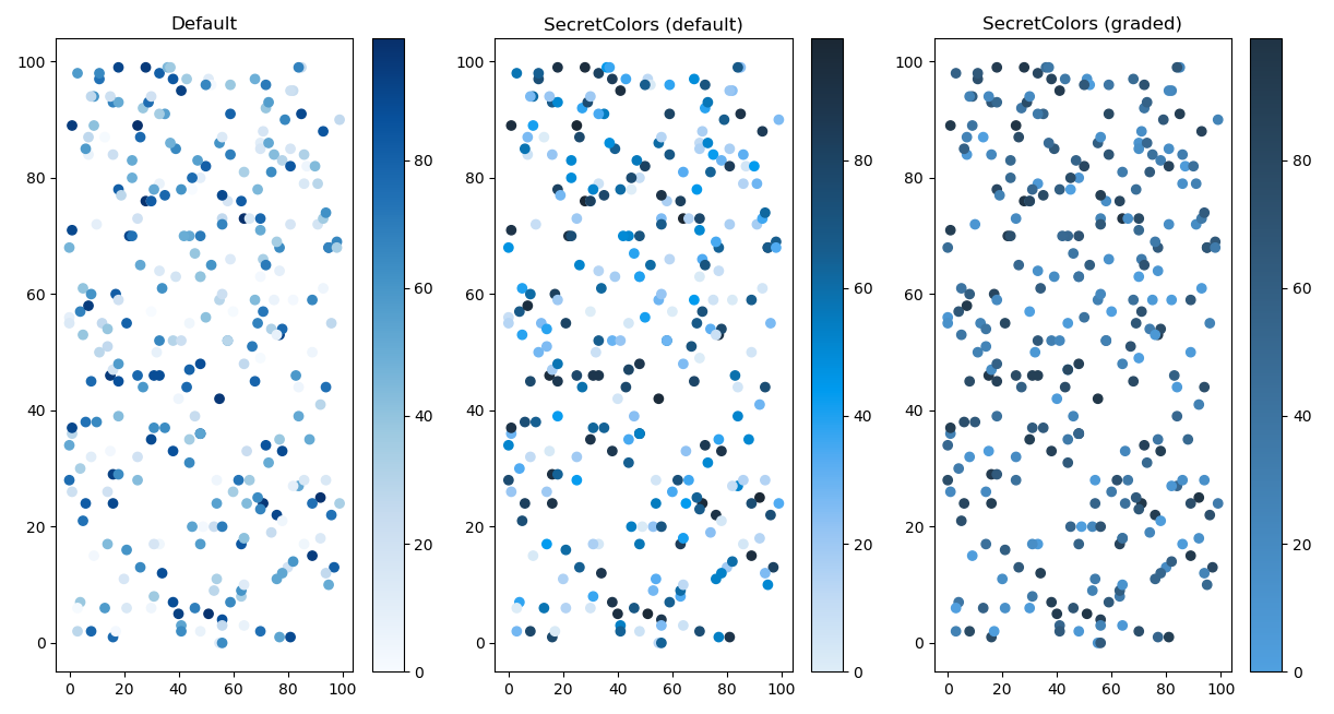
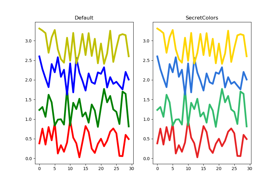
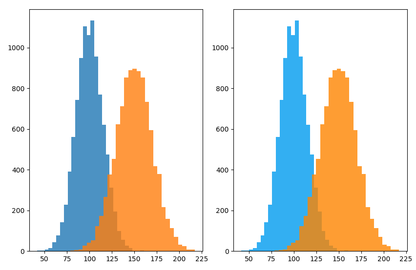
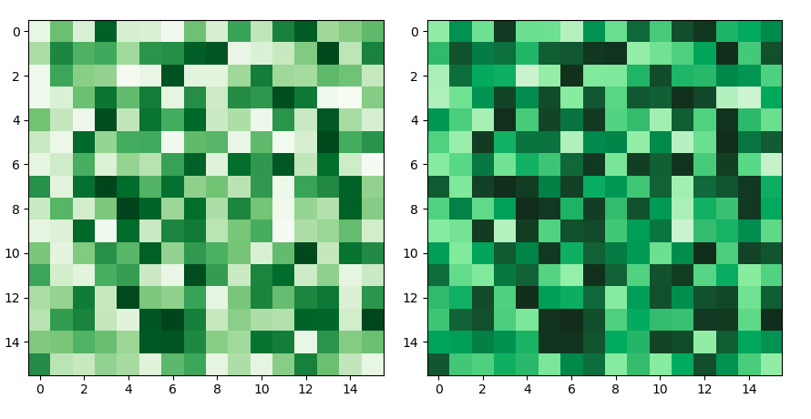
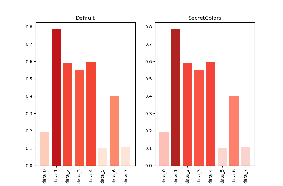
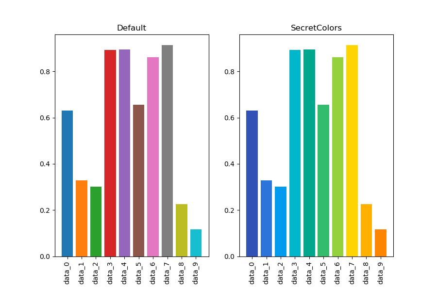
matplotlib provides very huge customization. This library is not providing any extra advantage to matplotlib. In fact, you can achieve exact same results by manually putting up color values. The main aim of this library to reduce time searching for colors and easy access to simple functions. In following plots I have used colors from matplotlib’s default palette and from SecretColors’s IBM palette. I have tried to use the same color grades for better comparison. Many of you might feel these are almost same colors but they are not :) Code used in following examples can be found in small Gist.
 |
|---|
| Fig 1: Scatter plot. Last gradient is changed by just passing one extra parameter. |
 |
|---|
| Fig 2: Line plot with default colors. |
 |
|---|
| Fig 3: Histogram with alpha values. |
 |
|---|
| Fig 4: Heatmap with default options. |
 |
|---|
| Fig 5: Bar graph with colors adjusted to respective value. |
 |
|---|
| Fig 6: Bar graph with default color cycle. |
This library is nowhere close to complete. A lot of functions needs to be added. However, already I am able to see the advantages of this library (at least in my data analysis). I have kept development open to all. Please feel free to provide feedback, suggestions or pull requests.
Code used in the above analysis can be found here.
(Header image is downloaded from Pixabay.com under CC0-license)