This post compares the color palettes of matplotlib and SecretColor. I recommend you to read basic concept behind this library first if you are planning to use this library in your workflow. However, if you are here to just enjoy visualization, then go ahead :)
Note that this library is focused on giving easy access to fantastic color palettes. You can essentially do the same job by copy and pasting original colors. Purpose of this library is to reduce time in searching and converting various colors. Using this library will add few more lines of code to your existing code but flexible and easy color access should make your visualization pop and definitely better than default matplotlib colors. Another note reader should remember that pretty colors is a subjective phenomenon and you should play around with this library to develop your own taste.
Full documentation of SecretColors can be found here
Default colors
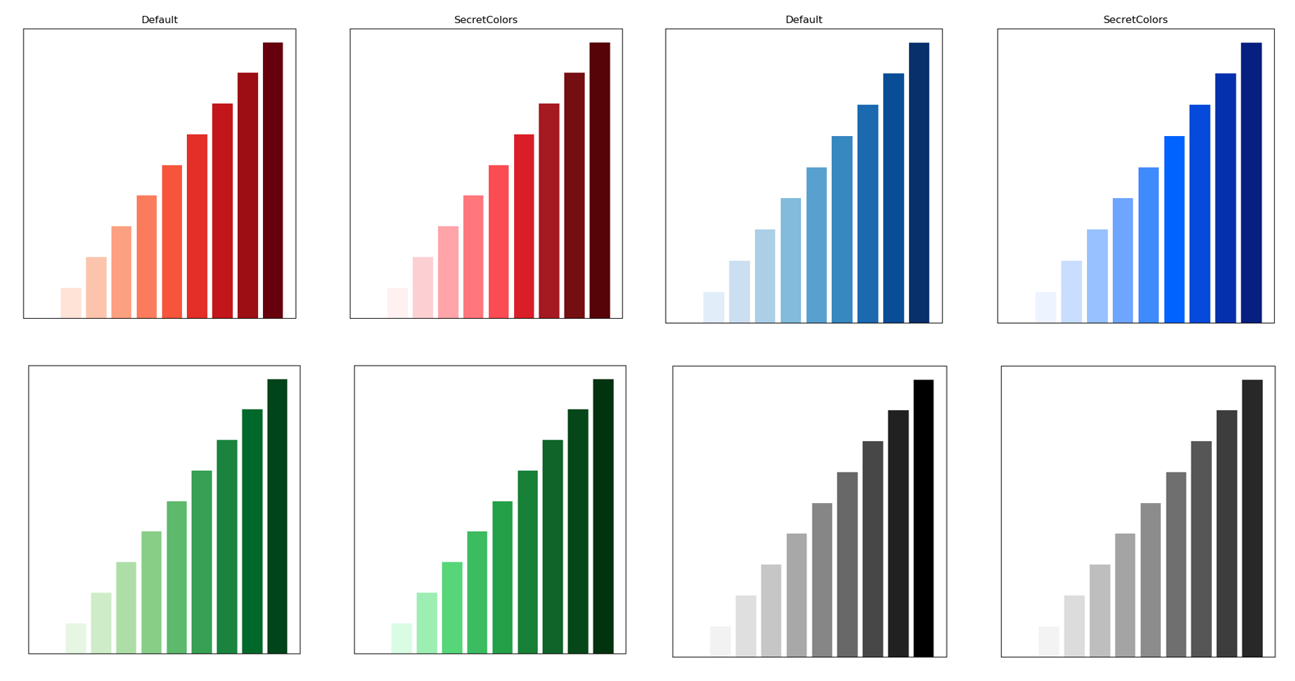
Let us first look at what are the main default colors in matplotlib and SecretColors. As SecretColors provides access to a wide range of color palettes, default colors will change according to the options provided while creating the Palette object. Few common colors from selected color palettes are compared with matplotlib default options in Fig 1.
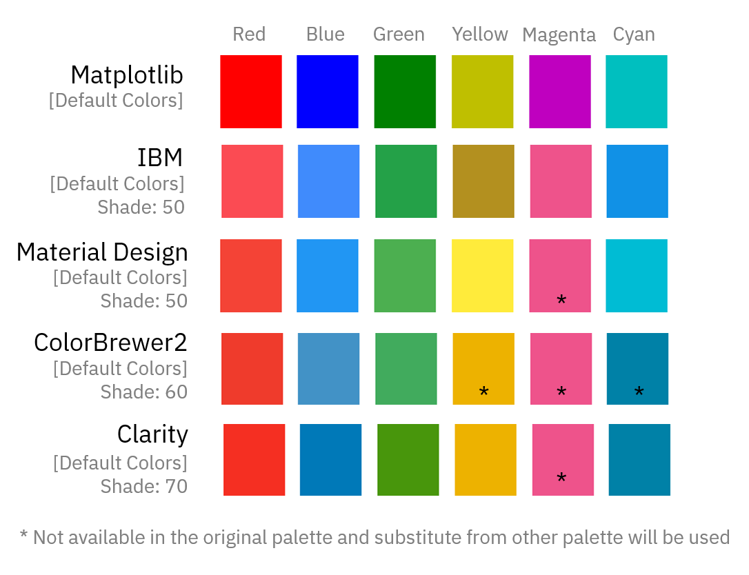 |
| Fig 1: Default base colors in matplotlib and SecretColors palettes. |
I liked IBM palette colors compared to others and hence I kept it as a default palette for this library. I did not like the yellow color from IBM. I was surprised that yellow can be that dark in such standardize color palette. When I took a closer look, I found that IBM has recently changed their color palette to version 2 which does not have yellow (as well as few other) colors. Hence, I mixed both v1 and v2 in this library.
For further analysis, I will use the IBM color palette for comparison. You have to decide yourself if default colors are good or is it worth investing time in this library :)
All the functions/features of the library provided below will work interchangeably with various types of plots. However, due to space constraint, I have used some representative plots.
Bar Plots
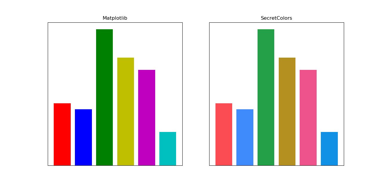 |
| Fig 2: Bar plot with basic colors. (Full Code) |
Default color cycle is a sequence of colors which will appear as you keep plotting with default color options. Matplotlib does this automatically. However, to use the default color cycle of this library, we need to get all default colors from current palettes with get_color_list property and then use them.
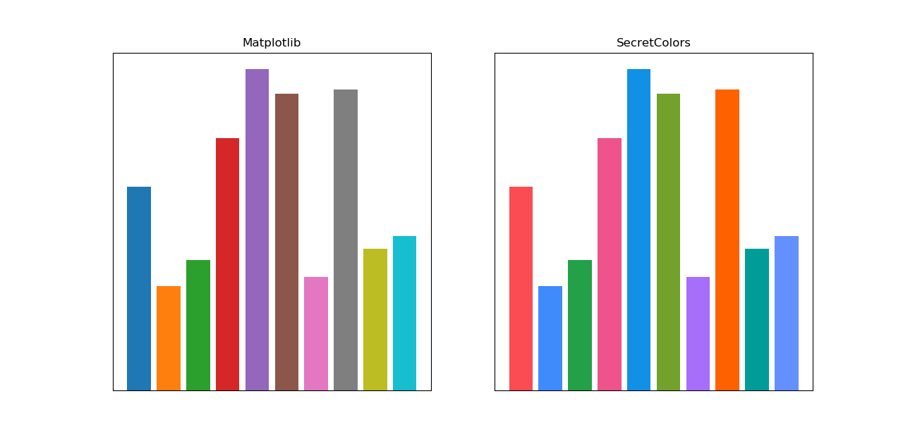 |
| Fig 3: Bar plot with default color cycle. (Full Code) |
Default color cycle in matplotlib supports only 10 colors, after which it keeps repeating the same cycle. In contrast, SecretColors’ IBM (default), Material and VMWare palettes provide more than 20 colors in default color cycle. Fig 4 shows full-color cycle.
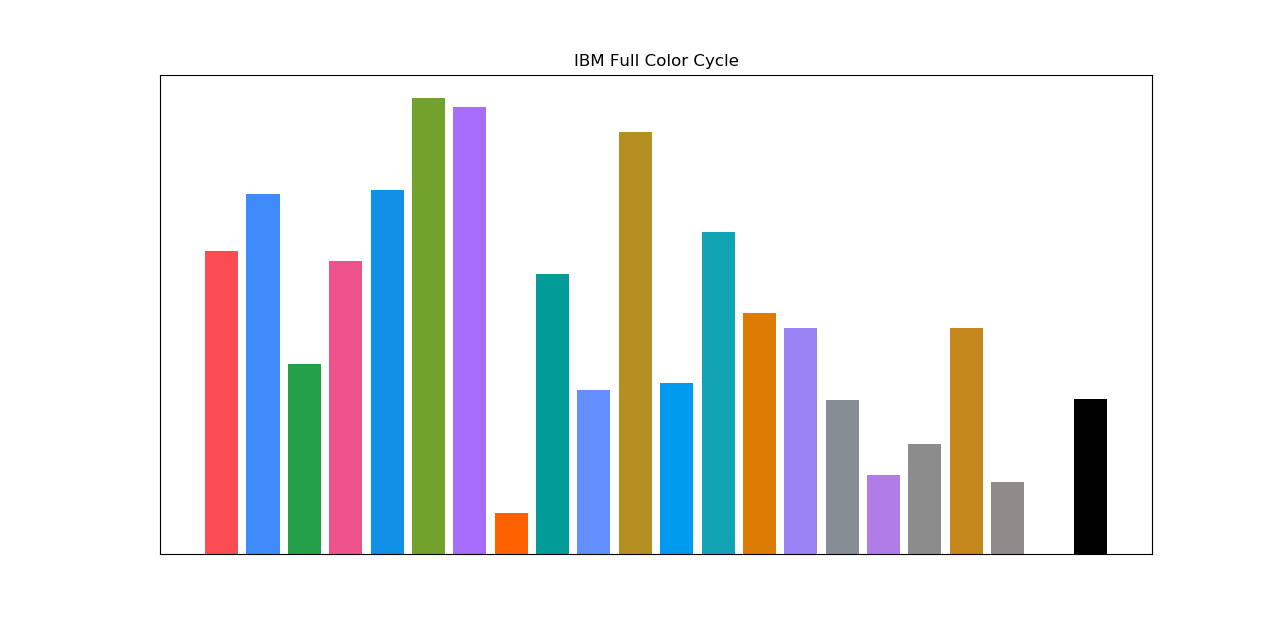 |
| Fig 4: IBM palette with full color cycle. (Full Code) |
I have tried to arrange colors in such a way that they will be more distinct from each other and also colorblind friendly. In the future, I plan to make this arrangement even better.
Next thing I checked how color gradient will look. For this, I had to used cmap function of matplotlib.
 |
| Fig 5: Color gradient comparison. You might want to see in magnified image. Right click and select ‘View Image’ to check full resolution image. (Full Code) |
Histograms
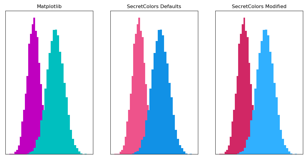 |
| Fig 6: Histogram comparison with Magenta and Cyan. You can dramatically change colors by just passing single parameter. (Full Code) |
Playing around histogram colors in just passing a few parameters. For example, the middle graph in Fig 6 was default with the following commands,
    plt.hist(data1, bins, color=ibm.magenta())
    plt.hist(data2, bins, color=ibm.cyan())
However, you can get last graph by just passing single parameter
    plt.hist(data1, bins, color=ibm.magenta(shade=60))
    plt.hist(data2, bins, color=ibm.cyan(shade=40))
Essentially, I just adjusted the shade of our colors and made both histograms pop. Fig 7 shows how one can use this library with trial and error to get the desired output. And all these trial and error can be done by just changing a single parameter.
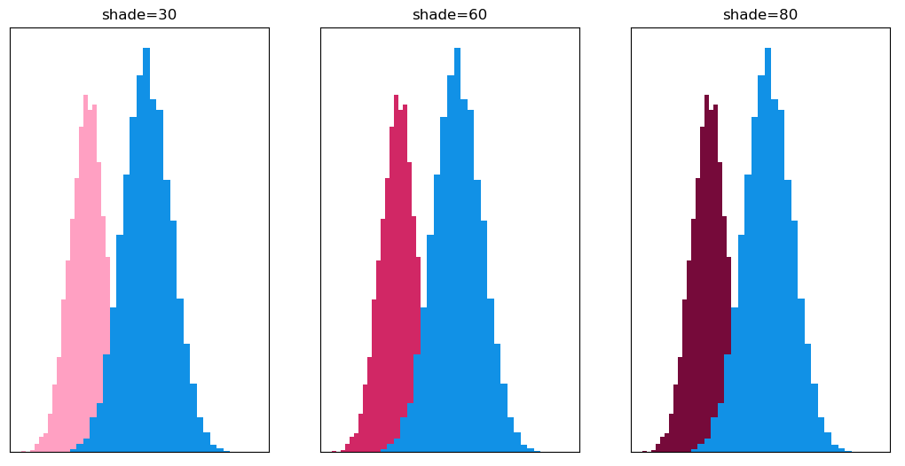 |
| Fig 7: Trail and Error with different shades of Magenta from IBM palette. (Full Code) |
Heat Maps
This library has special class called ColorMap which will be highly useful in visualizing heatmaps.
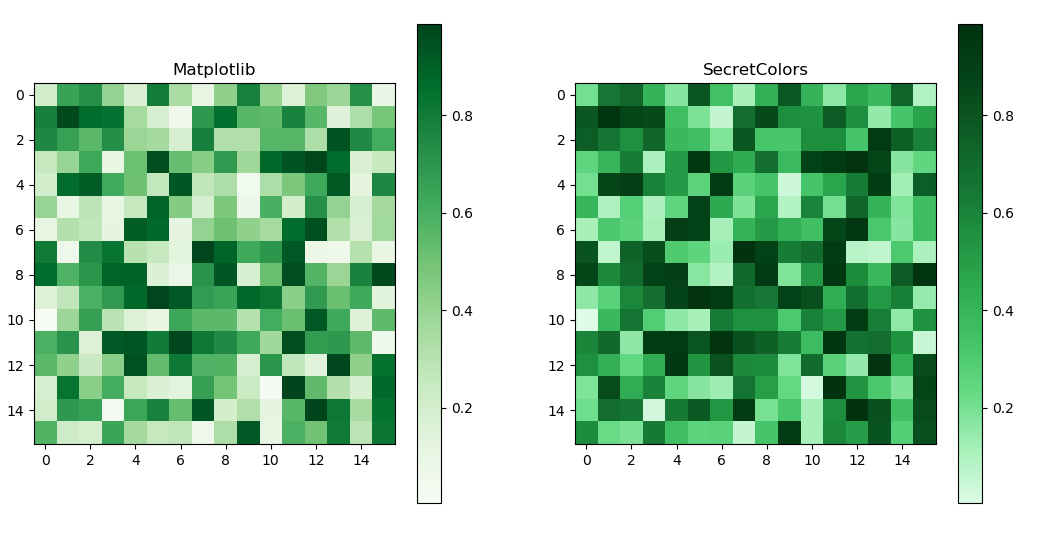 |
| Fig 8: Heatmap comparison with default colormaps. (Full Code) |
Currently, there are very few default maps in this library. I recommend using the highly customizable function of this class called from_list. This function essentially takes the color provided in the list (in the given order) and generates LinearSegmentedColormap or ListedColormap objects which are the objects through which matplotlib generates colormaps.
Let’s say, you want colors to go from light to regular green. You just need the following addition to the existing code. You can use a similar strategy for darker colors as well.
data = np.random.random((16, 16))
ibm = Palette(show_warning=False)
cmap = ColorMap(matplotlib, ibm)
plt.subplot(121)
light_colors = [ibm.green(shade=0), ibm.green(shade=50)]
plt.imshow(data, cmap=cmap.from_list(light_colors), interpolation='nearest')
plt.subplot(122)
dark_colors = [ibm.green(shade=50), ibm.green(shade=100)]
plt.imshow(data, cmap=cmap.from_list(dark_colors), interpolation='nearest')
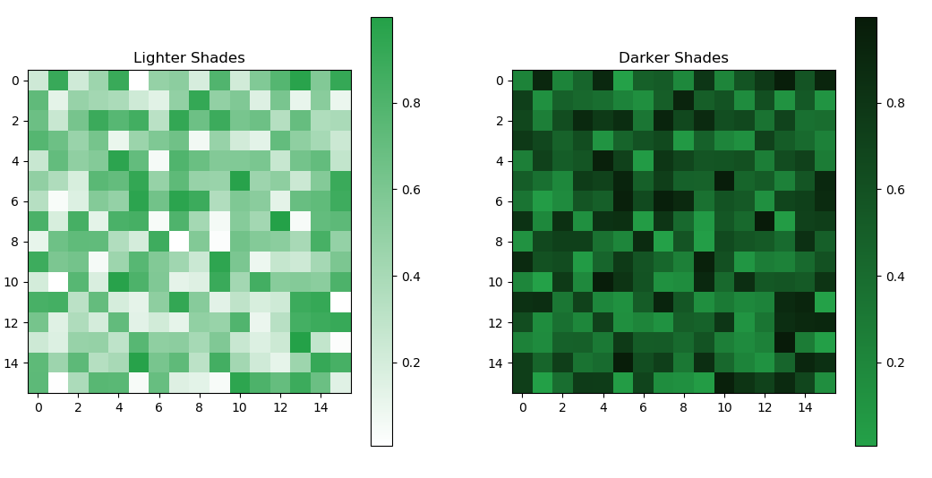 |
| Fig 9: Easy manipulation of colormaps by just changing color shades. (Full Code) |
You can adjust the gradient in your colormap by adjusting color order and shades provided during the colormap generation.
c1 = [ibm.green(shade=0), ibm.green(shade=30), ibm.green(shade=100)]
c2 = [ibm.green(shade=0), ibm.green(shade=50), ibm.green(shade=100)]
c3 = [ibm.green(shade=0), ibm.green(shade=70), ibm.green(shade=100)]
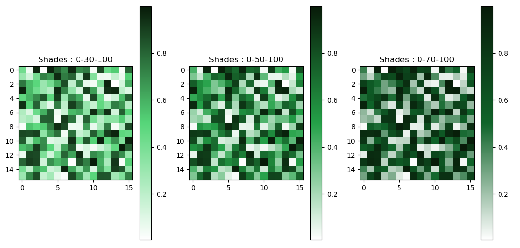 |
| Fig 10: Easy manipulation of colormaps gradient. (Full Code) |
We can convert any colormap to qualitative colormap by just passing the argument is_qualitative=True. colormap will be converted from liner to step-wise map. The number of steps will depend on the number of colors provided at the time colormap generation.
c1 = [ibm.green(30), ibm.green(80)]
plt.imshow(a, cmap=cmap.from_list(c1, is_qualitative=True),interpolation='nearest')
c2 = ibm.green(no_of_colors=5)
plt.imshow(a, cmap=cmap.from_list(c2, is_qualitative=True),interpolation='nearest')
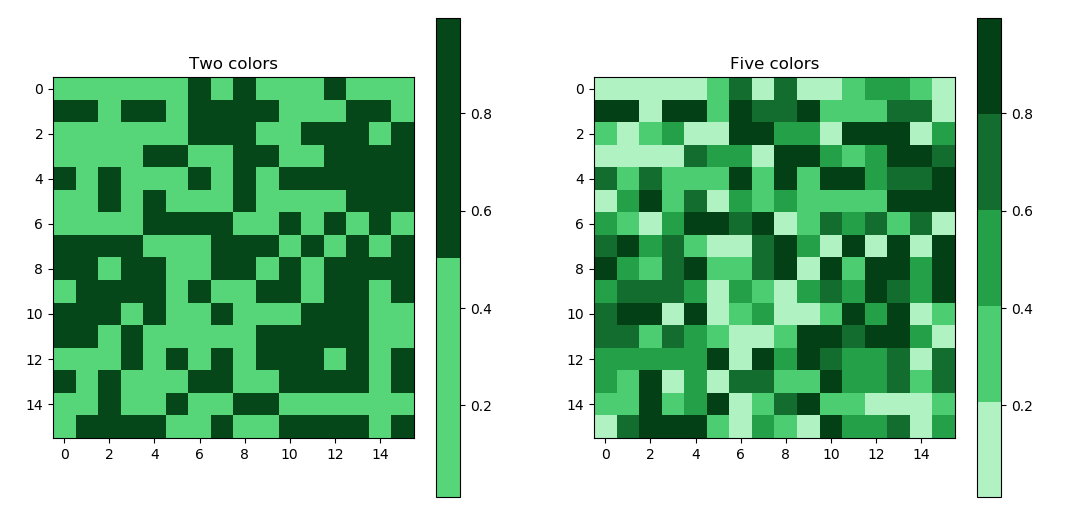 |
| Fig 11: Easy conversion of any linear colormap into qualitative colormap. (Full Code) |
Furthermore, we can also adjust various colors from the colormap.
yellow_purple = [ibm.purple(shade=80), ibm.purple(shade=40), ibm.yellow(
        shade=30), ibm.yellow(shade=50)]
black_br_lime = [ibm.lime(shade=30), ibm.brown(), ibm.black()]
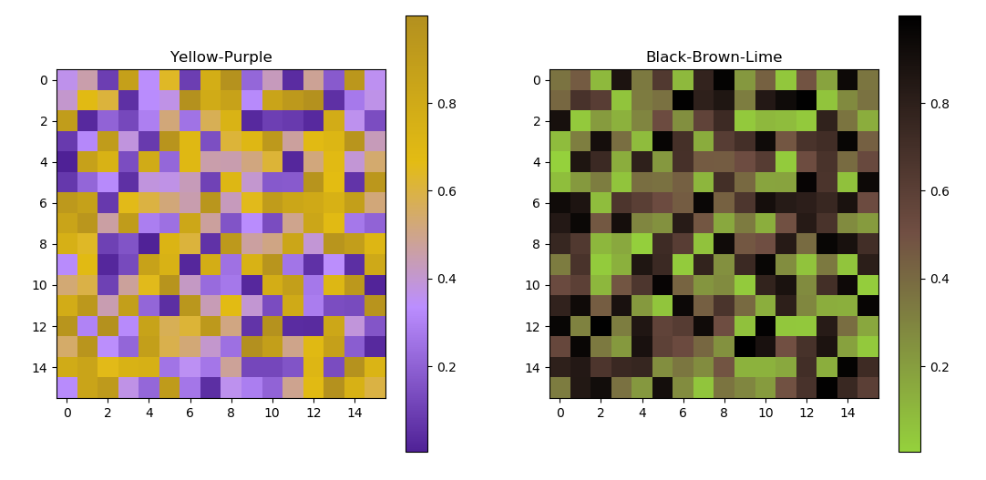 |
| Fig 12: Easy generation of colormaps with different colors. (Full Code) |
Compatibility with other plotting libraries
Seaborn is an extension of matplotlib, hence SecretColors works with Seaborn with a little bit of tweaking. However, currently, this library does not have any function optimized for Seaborn. In the future, I might implement seaborn’s special ‘palettes’ out of the box.
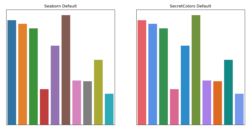 |
| Fig 13: Seaborn essentially uses matplotlib as a base. Hence seaborn’s default color cycle is same as that of matplotlib. |
I tried using this library with ggpy, but at the time of writing this blog, it was suffering from some pandas bug and could not check.
Feel free to test and use this library and provide your feedback and criticism. Visit homepage of this library for installation instructions and full documentation.
Code used in the above analysis can be found here.
(Header image by janjf93 from Pixabay, released under CC0-license.)